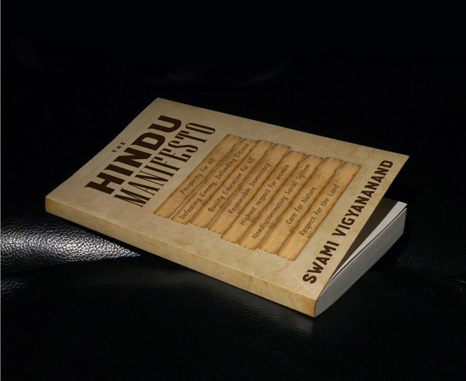
Brand Identity
World Hindu Congress
Event Branding & Identity
Event BrandingVisual IdentityIllustrationPrint
Explore
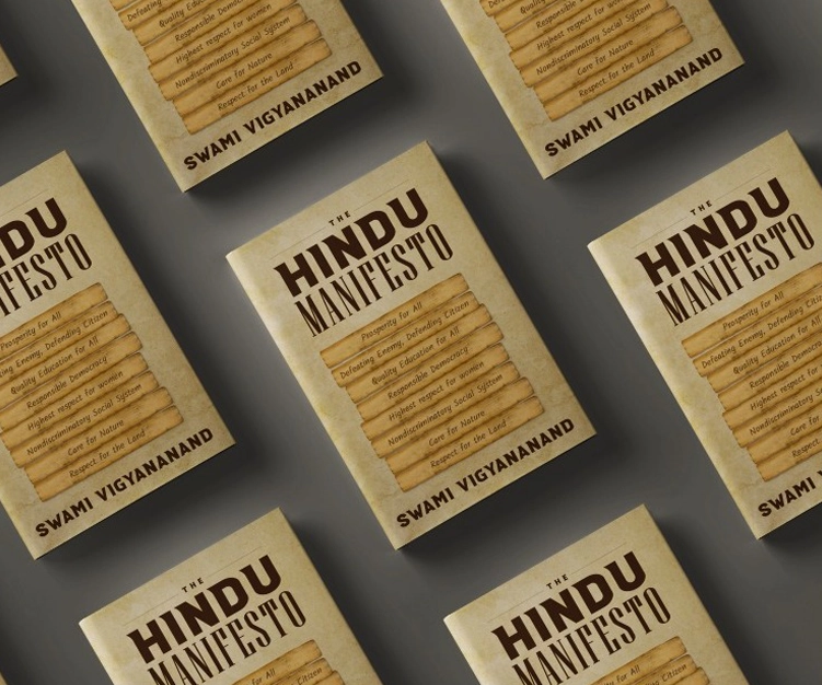
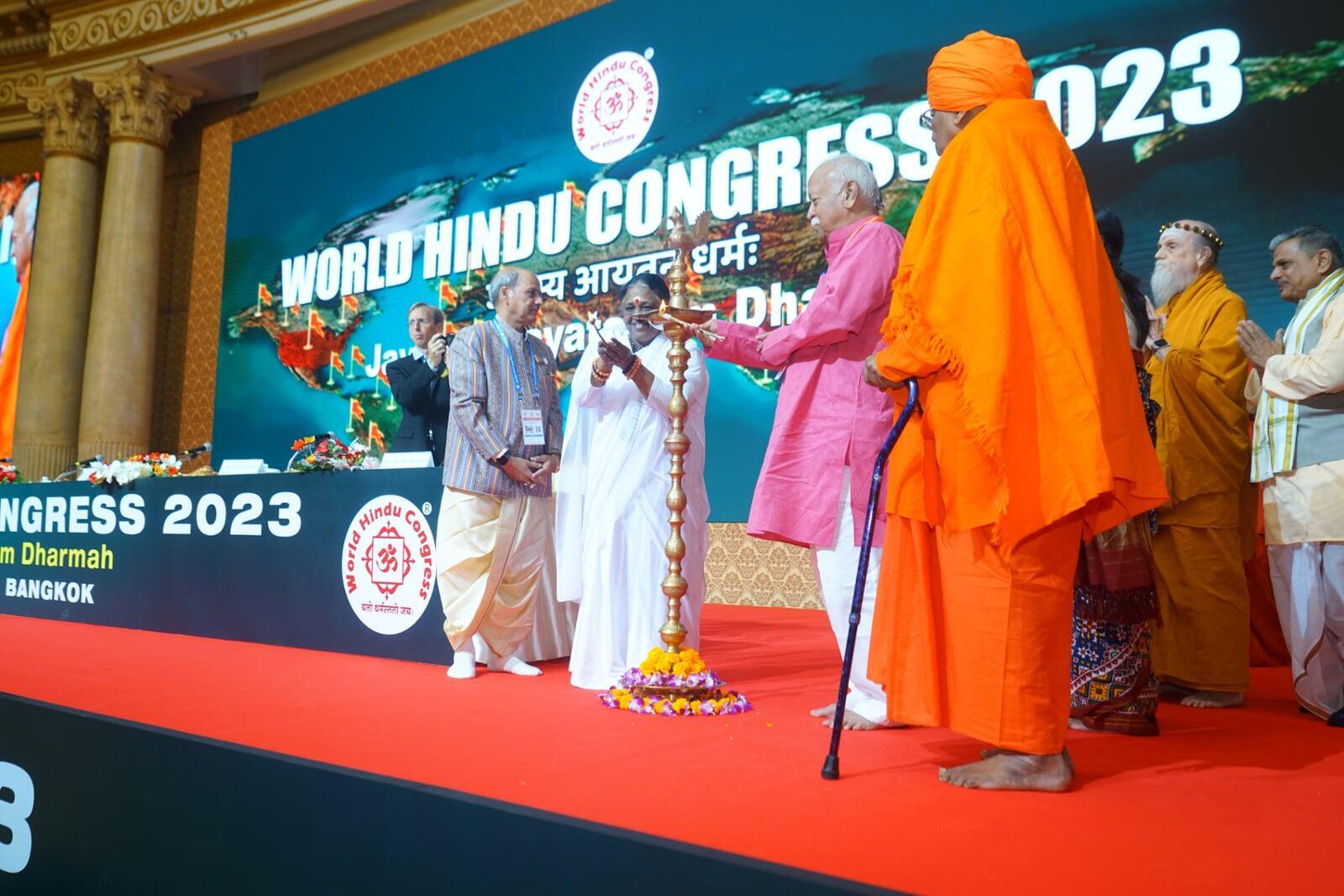
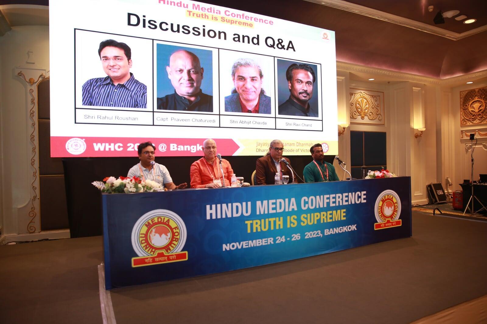
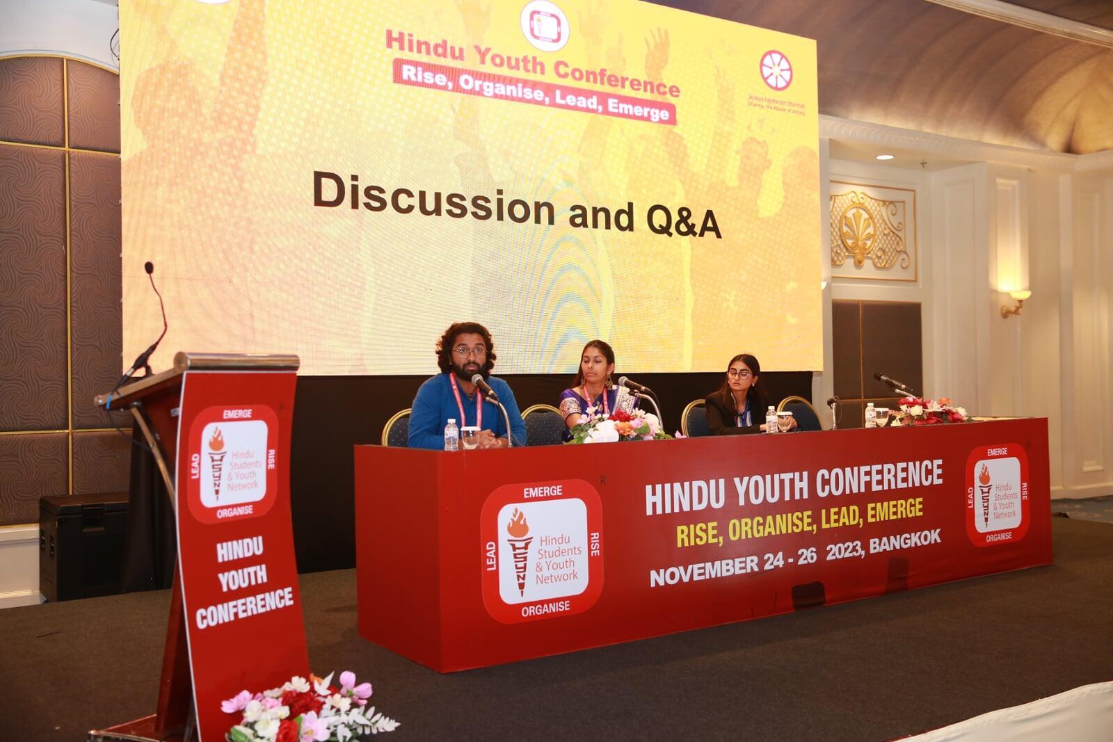
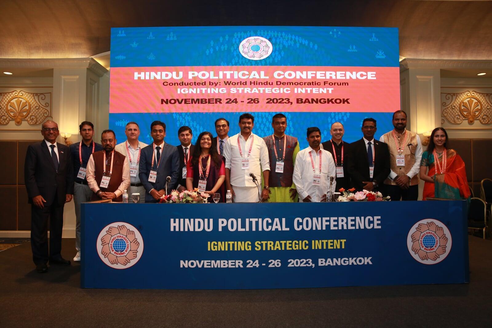
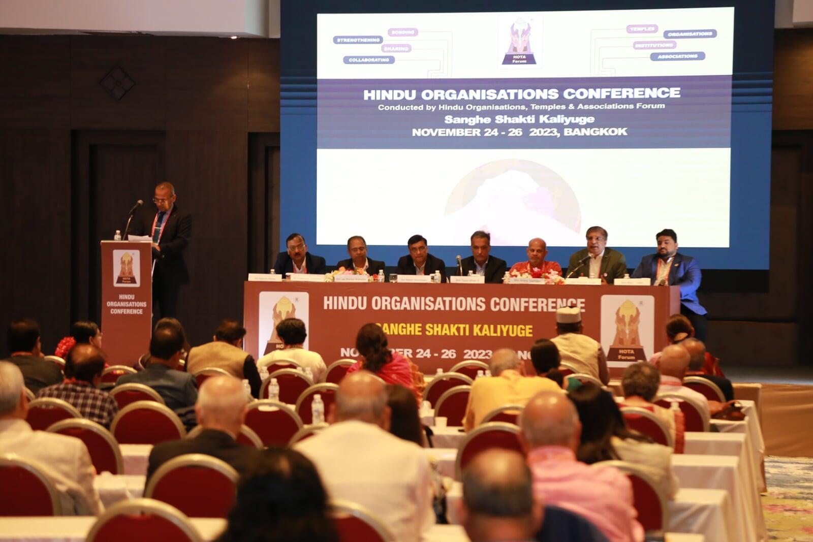
An event of this scale doesn't need a logo — it needs a visual language. The World Hindu Congress brings together delegates from across the world, and the branding has to hold its own across stage backdrops, signage, programmes, badges and digital screens without ever feeling thin or repetitive.
The work began with understanding what the Congress wanted to communicate. Not just "this is an event," but a sense of continuity — of a tradition being carried forward into a contemporary, global conversation. Every visual decision had to carry that weight: the mark, the typography, the illustration language, the way colour moved across surfaces.
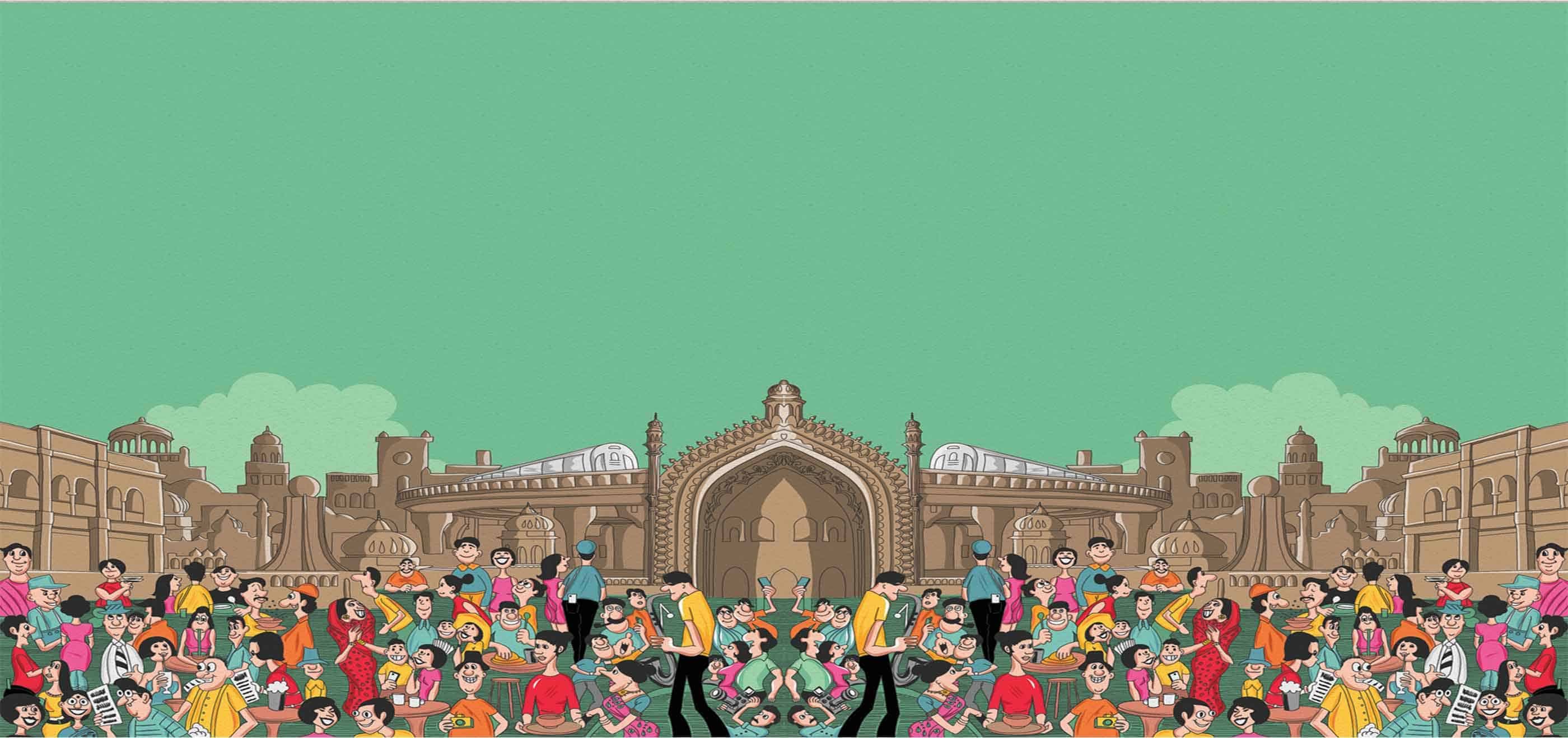
What I built was a system, not a single asset. A primary identity that could stand alone on a podium, supported by a flexible set of elements — illustrative motifs, patterns, and a typographic hierarchy — that could expand or contract depending on the surface. A stage backdrop needs to read from thirty metres; a delegate badge needs to read from thirty centimetres. The same language serves both.
The hardest part of event branding is that it has to feel inevitable. Once the Congress begins, every surface is already branded — there's no iterating after launch. So the system has to be right the first time, robust enough to handle surfaces I won't see, and coherent enough that everything feels like it belongs to the same gathering. That coherence is what makes a large event feel considered rather than assembled.
What's your story?
Every piece of work on this page began with one. Tell me yours, and we'll figure out what it should become.