Branding
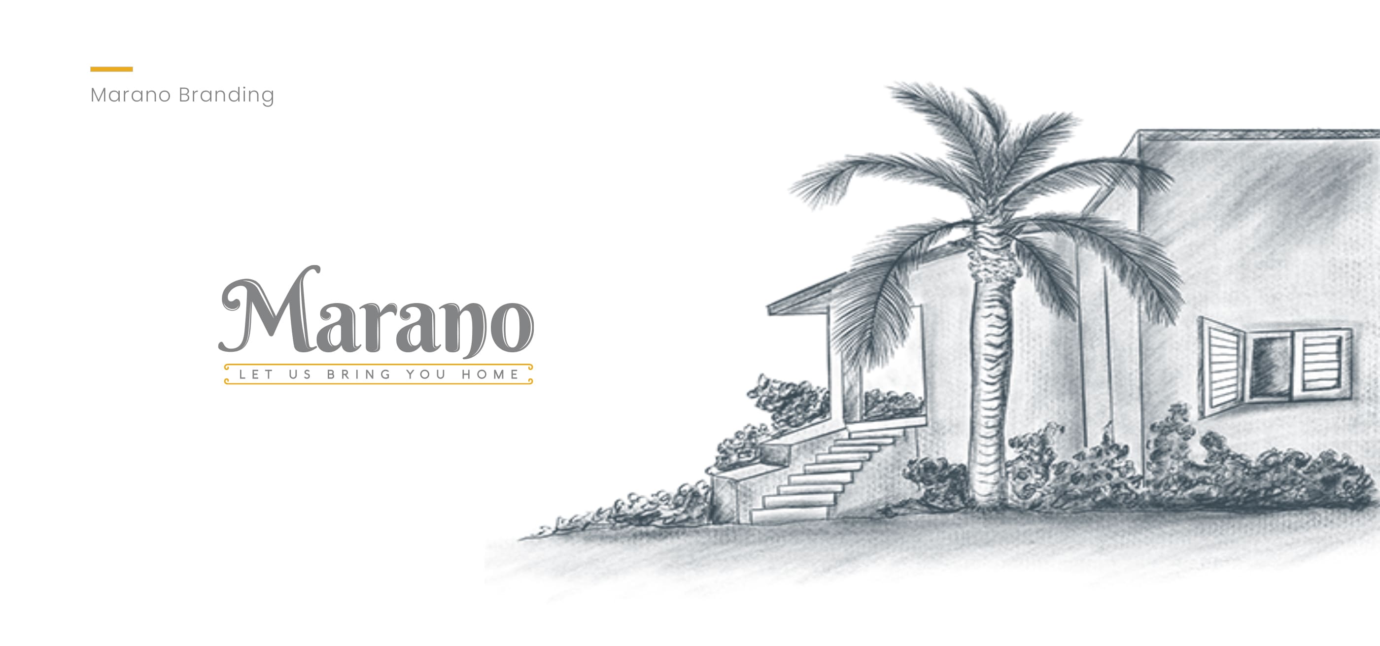
Morano
Logo & Visual Language·2023
Explore
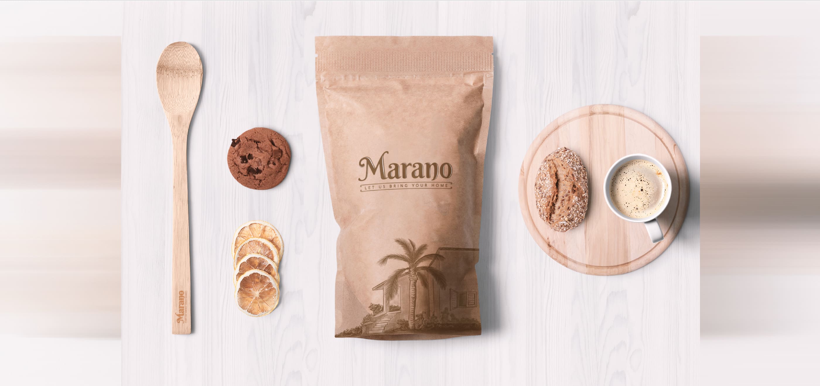
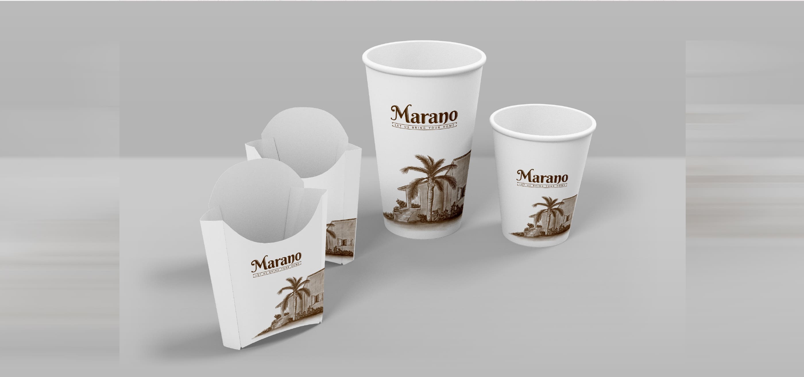
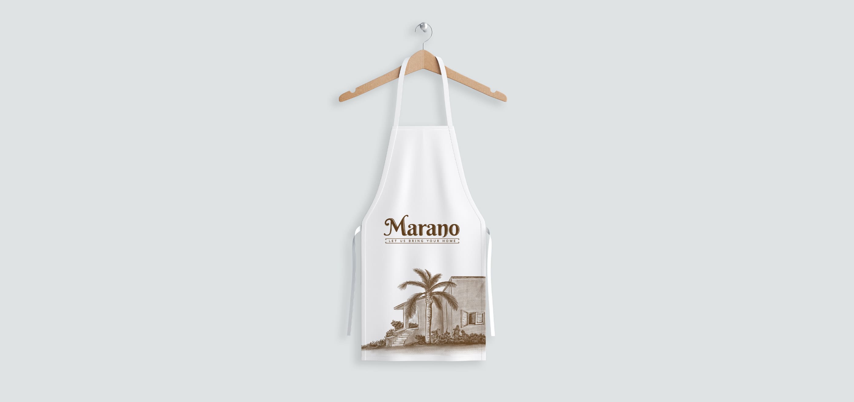
Marano is a US-based bakery store that was looking for a team that could help them with the Logo and the Visual Language representation. They came across Odd Monk and all they were filled with were praises for the kind of work Odd Monk created for their bakery.
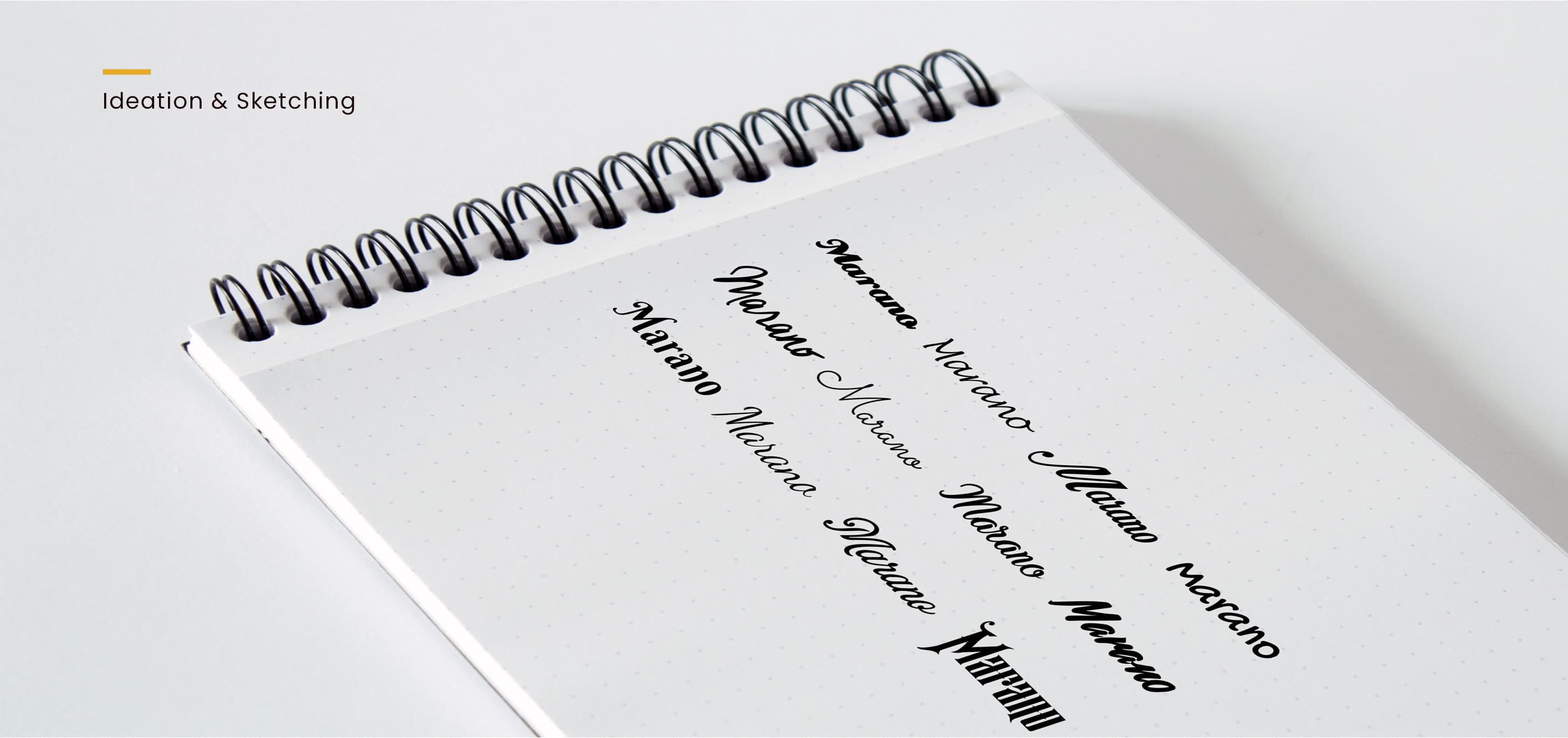
This was surely a tough client. The client was originally Italian but resided in the US, and thus demanded a design that radiated the amalgamation of US & Italian magic. Odd Monk pulled up the socks and began their creative research. In the end, Odd Monk proudly presented a set of designs that surely amazed the client with the detailings and other associated aspects.
The challenge was balancing two distinct cultural identities within a single visual system. Italian bakery tradition carries a certain warmth — rustic, familial, rooted in generations of craft. American bakery culture, on the other hand, leans toward clean modernity and bold presentation. Finding the sweet spot where both sensibilities coexist without one overshadowing the other required deep exploration of typography, colour, and imagery. Every element — from the logotype to the packaging patterns — had to feel like it belonged to both worlds simultaneously.
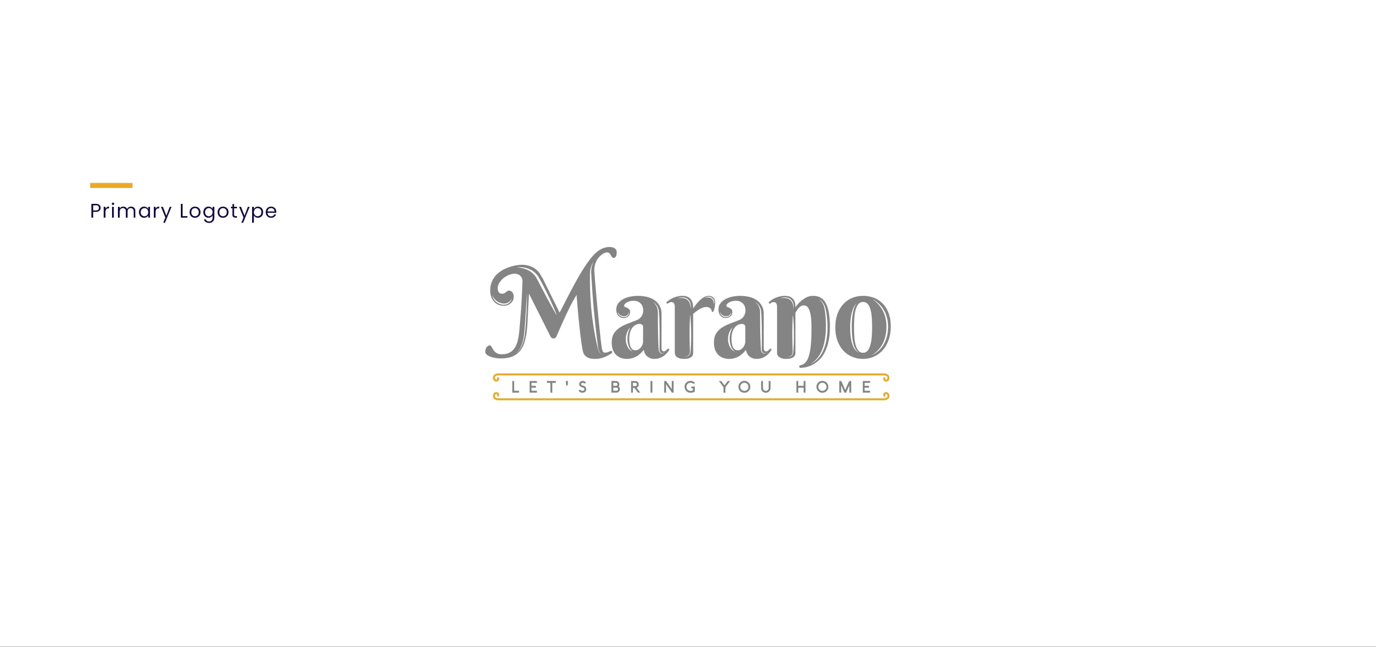
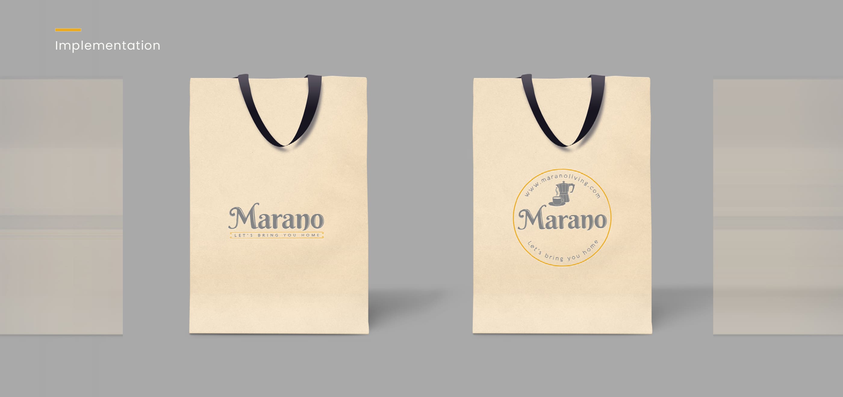
You can glance at the designs below that made our clients feel proud and happy.
Let's Connect
Have an idea in mind? I'd love to hear from you and explore what we can create together.